
Squarespace How To: Show a Different Banner Image on Mobile
HOW TO
How to hide and replace entire index sections for optimal design on desktop and mobile.
Ever had an awesome design for desktop that simply won’t work on mobile? While you can set media queries to target your fonts like this tutorial here or fix your on-page images like this tutorial, sometimes these adjustments just aren’t enough to turn awful mobile views into awesome. Here’s a roundup from top Squarespace designers plus one of my own to give your mobile view a pro-level upgrade.
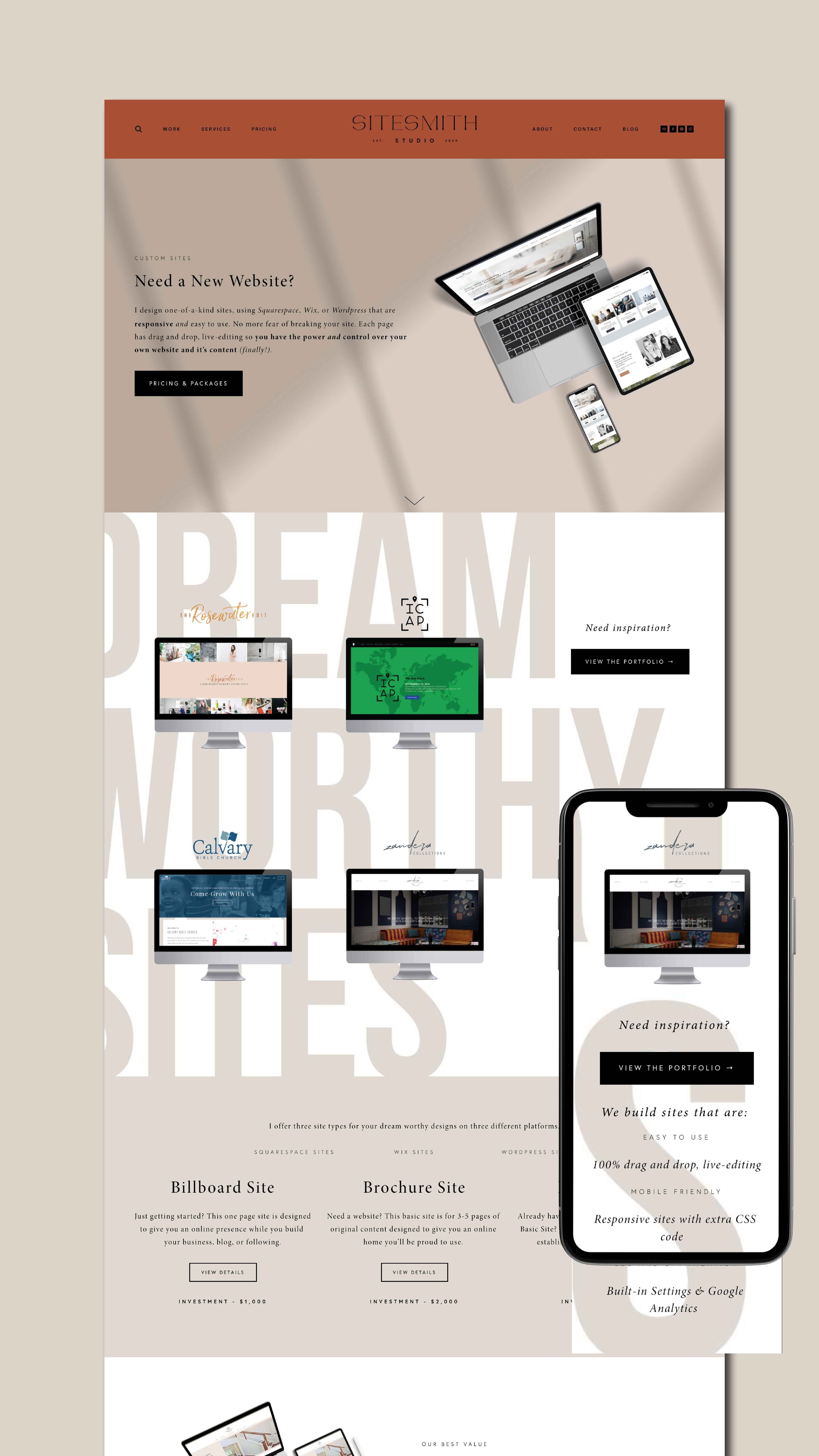
Recently, SiteSmithStudio.com got its own refresh. While a design overhaul is not recommended frequently, there are specific instances when you should consider a redesign. If your business model or strategy has changed, or you’ve grown beyond your initial vision you might consider a rebrand. Originally, SiteSmith Studio began as a custom solution for DIYers to get the site of their dreams on a platform they can actually use. At that time, our concentration was almost entirely Squarespace. Most clients came to us as frustrated wordpress users or new startups with no site experience. With a logo in hand, most clients wanted a single site to expand their reach into the vast online market.
We started seeing a trend where clients would fall in love with their site design and want that same wow-factor for their logo. To accommodate this growing demand, we now offer three site options for varying levels of business along with discounted packages for both branding + site design. To help communicate these changes, we redesigned our welcome, services, and pricing pages as well as each of our product offerings. Only, what looked great on our desktop view, looked just plain awful on mobile.
The Problem
Did you know most people view your site on mobile not on desktop? In just 5 years, worldwide use flipped dropping desktop views from 60% down to 43%; while mobile views increased from 35% up to 54%. That number has held steady throughout 2021, proving how critical it is to focus on your mobile strategy.
Squarespace advertises their platform is already mobile-friendly. In most cases — it is. People love it for its beautiful design and long, scrolling pages. The problem, though, is while your desktop views look awesome, your mobile view might not. On Squarespace, this is particularly noticeable on index pages that use a background (banner) image. What works on a large, desktop screen is often a slice of your image, too cropped to make sense on mobile.

https://gs.statcounter.com/
Take this site for instance — shown below — I’ve designed a few full-width, text backgrounds on my welcome, pricing and services pages. On desktop, they make great backgrounds, but on mobile they’re distracting and pointless.

Some awesome designer/developers have great resources on this problem. Like this one from Chris of S-E Web Design explaining why this happens and how to avoid it. The go-to first step is to adjust the index section focal point, but in my case, that doesn’t solve the problem.
Solution #1 : COVER image with color block
One option is to cover the image that’s not working with a solid color like this free tutorial from Rebecca Harpain with Inside the Square. Super simple and very effective, however, since the SiteSmith Studio site already uses an alternating tan and white color block design, making these trouble sections plain white felt too basic and boring.
Solution #2 Move image above page text
If you’ve got a compelling image on desktop, having a color block may be a downgrade. Another option is to code the banner image so instead of a background image behind your whole section, it can site above the page content like this tutorial from SquareStylist. While the implementation of this code is a bit more advanced, the solution is genius and doesn’t require a ton of code. Again, because of our mobile strategy, this solution wasn’t quite perfect for our site.
Solution #3 : Replace image with Mobile-friendly version
If you want to keep an image, but the desktop one doesn’t work as a stand alone, try replacing it with one sized specifically for mobile like this tutorial. That’s right— you can keep an image as your background but have totally different version on desktop vs. mobile with just a bit of code. While this solution actually worked to solve a few of our trouble spots, ultimately, I realized what we needed was an entirely different mobile experience. Only, this type of design isn’t possible on Squarespace. The native editor for Squarespace takes all the elements on desktop and stacks them for mobile. However, our next solution will show you how to have one version for desktop and an entirely different version for mobile with a bit of code.
Solution #4: HIDE/Replace index section
In addition to a different banner image, I wanted the mobile version of our services page to have a different order than it’s desktop partner. Rather than the portfolio CTA “Need some inspiration?”, being the start to this section, I wanted our value proposition, “we build sites that are…” to be the lead. This text is supported by the site examples below it, but instead of 4 separate images/galleries like on desktop, I only included one so there is less scrolling before you get to the portfolio CTA. These blocks sit beautifully overtop a new vertical version of our brand message, “dream worthy sites,” designed just for mobile. All in all, our mobile version is very similar to desktop, but it’s only viewable on that small screen size.
How is this possible? By using the same media query we’ve used in our past mobile tutorials, you’ll target the urls of both the desktop and mobile index sections.
I recommend naming these index sections something simple like, “intro-desktop” and “intro-mobile” for your sanity and ease later. If you’re on a live-site, you can always disable the mobile section while you work, then enable when you’re ready to add this code. Ready to give it a go on your site? Here’s the code:
Desktop Section CODE
@media only screen and (max-width: 780px) {#indexsection-desktop {display: none !important;}}
MOBILE Section Code
@media only screen and (min-width: 781px){#indexsection-mobile {display: none !important;}}
what about ReplacING multiple index Sections?
If you have multiple index sections you need to hide, you can target them with the same code by their specific index url. On our pricing page alone, I have another two mobile-specific sections with entirely different content.
Instead of duplicating the existing desktop version like our last example, these mobile versions add extra elements; specifically the Stack design image block. By using an image here, I can better show the package deliverables and break up the text copy so viewers can more easily engage with the content.
If you haven’t used it, the Image-stack is super useful. The design panel gives you the ability to set the fonts, button styling and card background color. With that last option, I made my card background white so I could add a branded pattern as a background for the section. In my example, you’ll see our “scribble” brand element conveying the brand message of “un-complication” behind the image block giving this mobile design a look all it’s own.
Following the same process as before, simply hide your desktop version with the max width code and hide your mobile with a min width code for each instance. Personally, I like to separate mine with a title so it’s easier to find like this:
/* index section */
@media only screen and (max-width: 780px) {#indexsection-desktop {display: none !important;}}
@media only screen and (min-width: 781px){#indexsection-mobile {display: none !important;}}
What about squarespace 7.1 sites?
Our site is a Squarespace 7.0 on the Mojave template, but you can achieve the same result on Squarespace 7.1 by following Christy Price’s exhaustive tutorial here.
CODING Resources you should bookmark
https://insidethesquare.co/


