ICAP Global :: We Are Here.

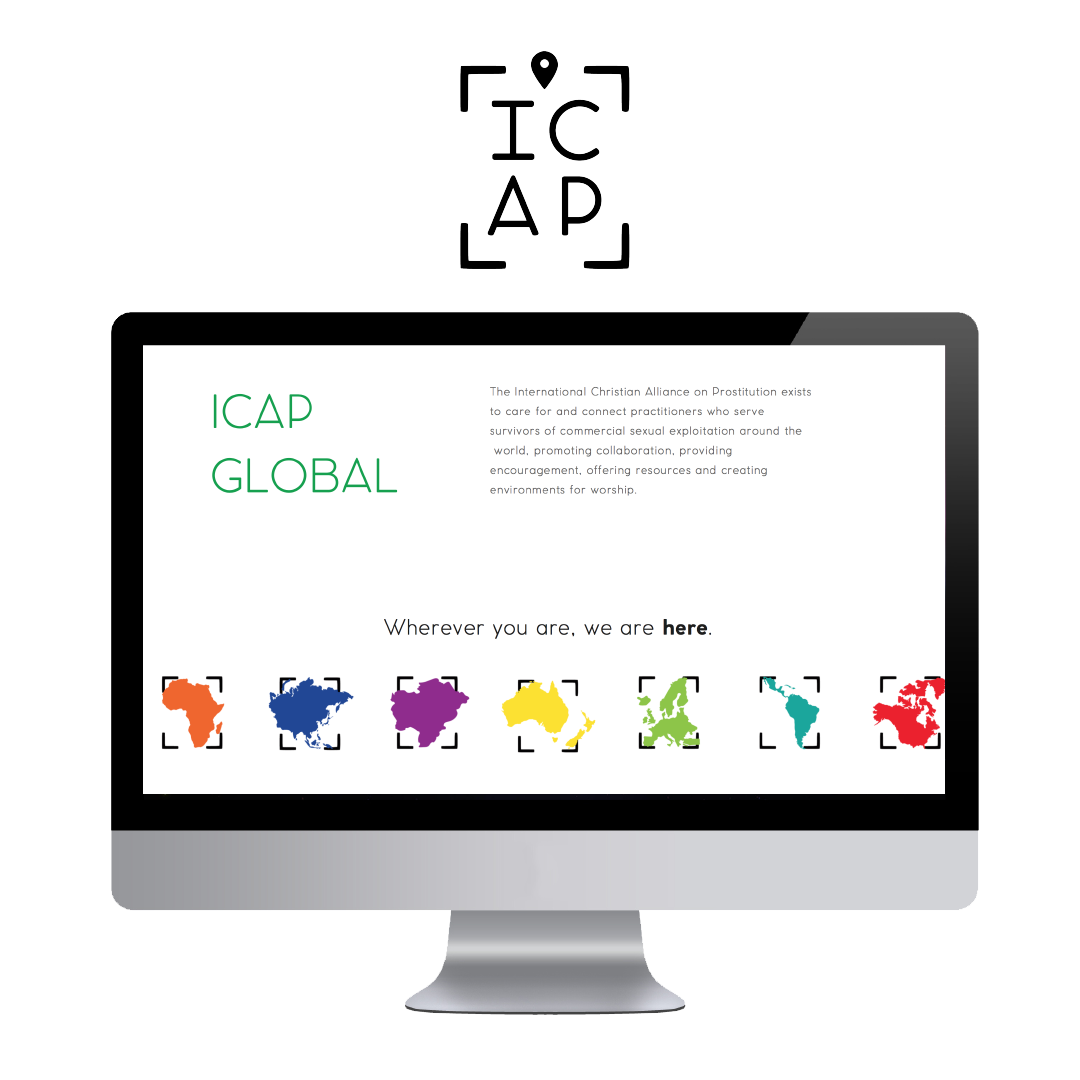
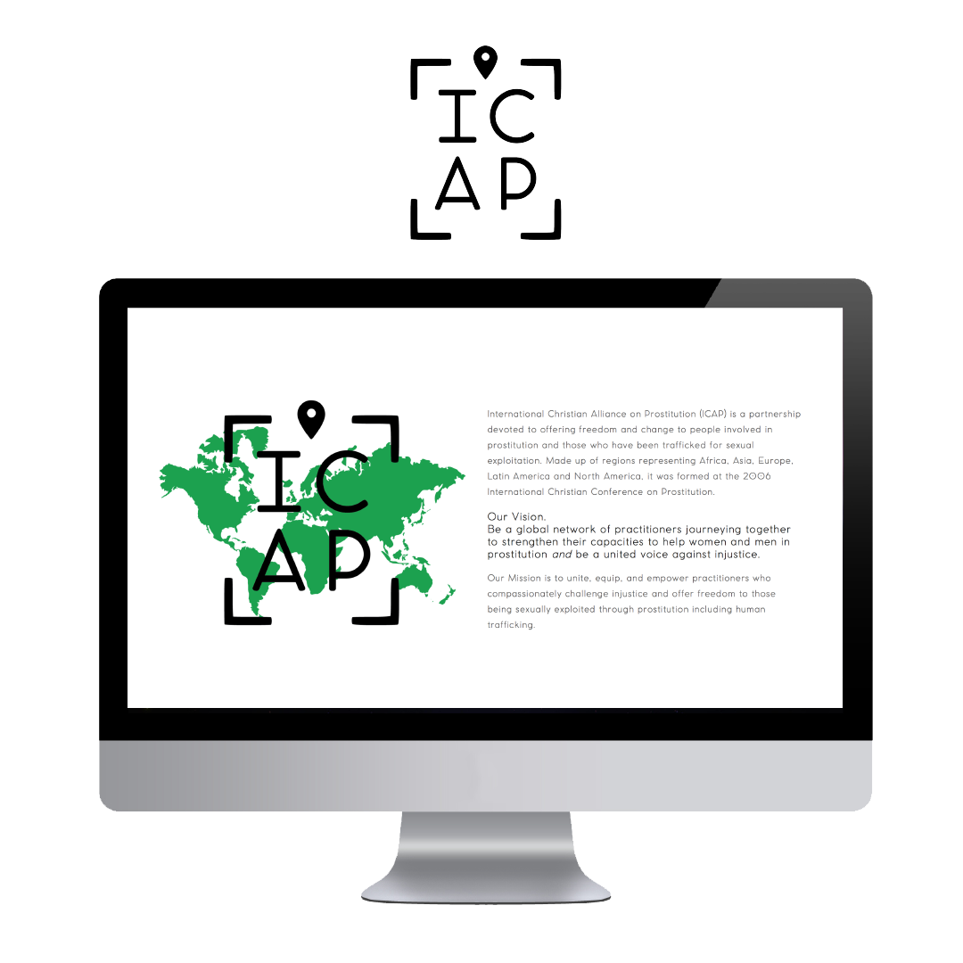
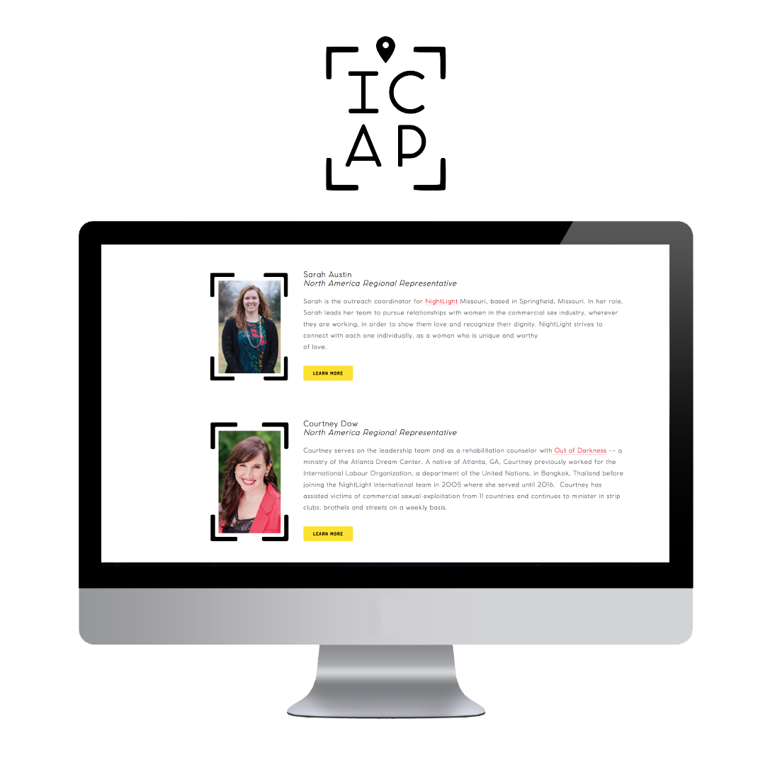
Long-time friend, Courtney, came to me for a rebrand of ICAP global. The International Christian Alliance on Prostitution exists to connect practitioners who serve survivors of commercial sexual exploitation around the world, promoting collaboration, providing encouragement, offering resources and creating environments for worship. To achieve this vision, they host conferences designed to provide safe places to be heard knowing one is not alone in this work.
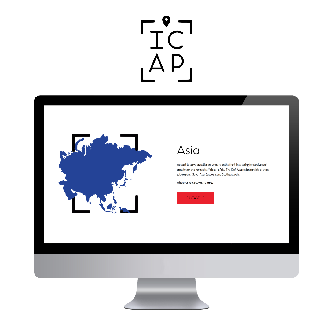
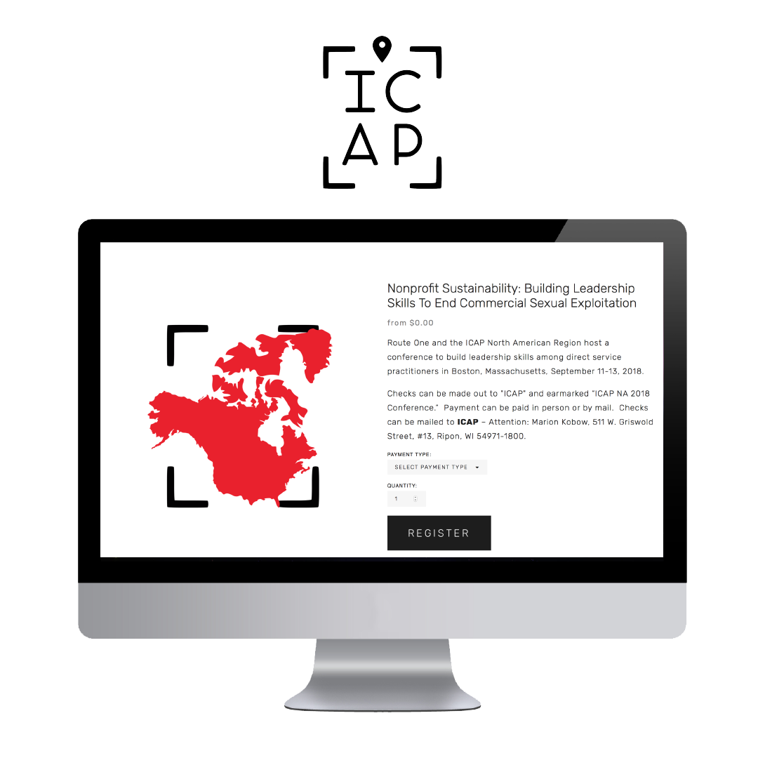
Being that ICAP works in 7 different regions across the globe, I wanted custom icons for each region and a european or swiss style that could cross cultural barriers. Click here to view the final result or keep reading for a behind the brand story.
Collaborative board on pintrest.
BRANDING

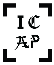
The final concept was a mash up of the first draft of concepts - 1 and 3. All were a a modern and minimal type and I liked each one for a different reason. My main focus was creating an identity to communicate, "you are not alone." No matter where you are working, to be a part of ICAP means you're connected, supported, seen, and part of a collection of heroes fighting for freedom.
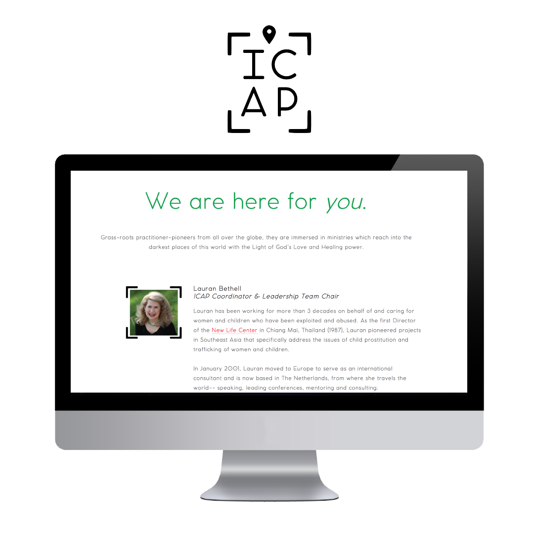
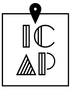
Working with the leadership, we landed on a casual font with rounded edges and a "you are here" marker you might see on a mall map and broken corners to convey a search feature.


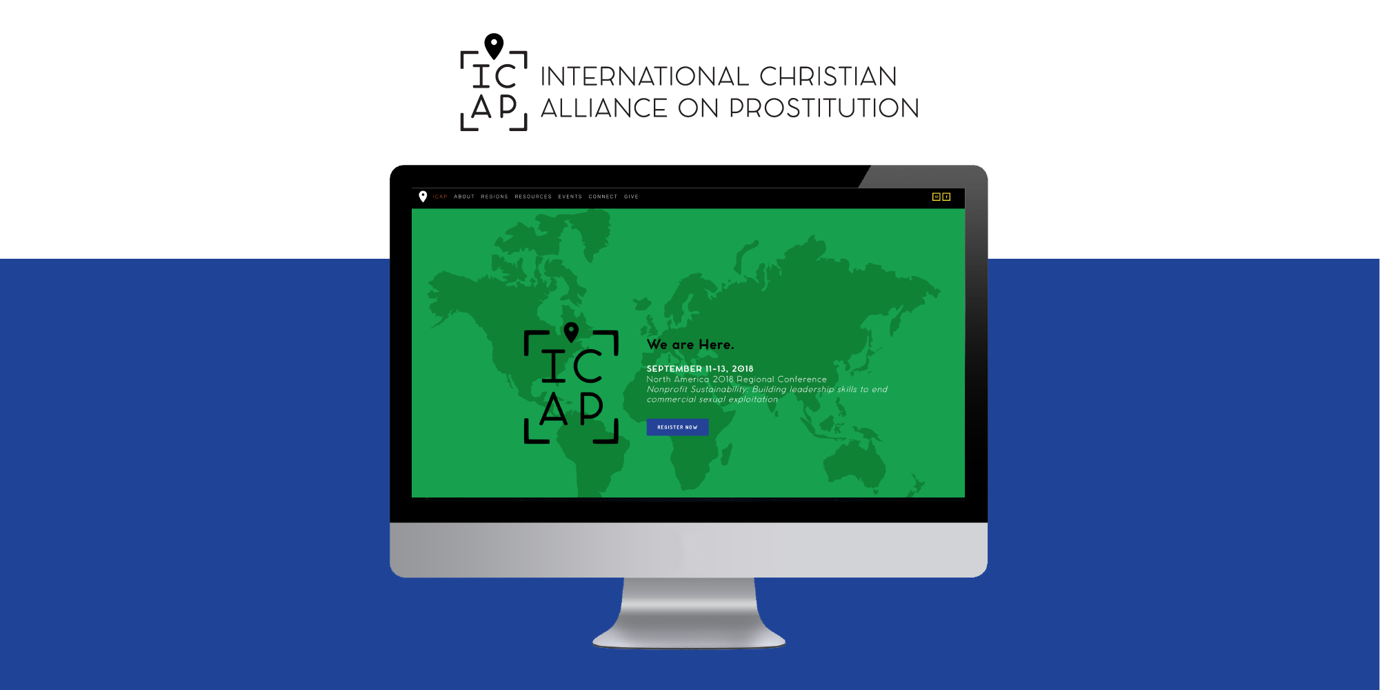
Squarespace site
By now, you know I love squarspace. For this site, I used the Brine template because of the ecommerce needs with hosting large conferences all over the world. Each ticket is it's own product and the welcome page is a billboard for the upcoming gathering. My favorite element is the use of a gallery on the home page acting as a secondary navigation for each region by icon. These are specific to ICAP only including the areas they work in.