
Mend & Mae: Wholeness Inside + Out
Maeghan came to me with an idea. She wanted to combine her passion for life coaching and personal development of leaders with her love for essential oils and healthy living. Most of my clients have come to me with a name, or the beginnings of one for branding, so this was the first project I could dream into from the beginning. Here's what we created.
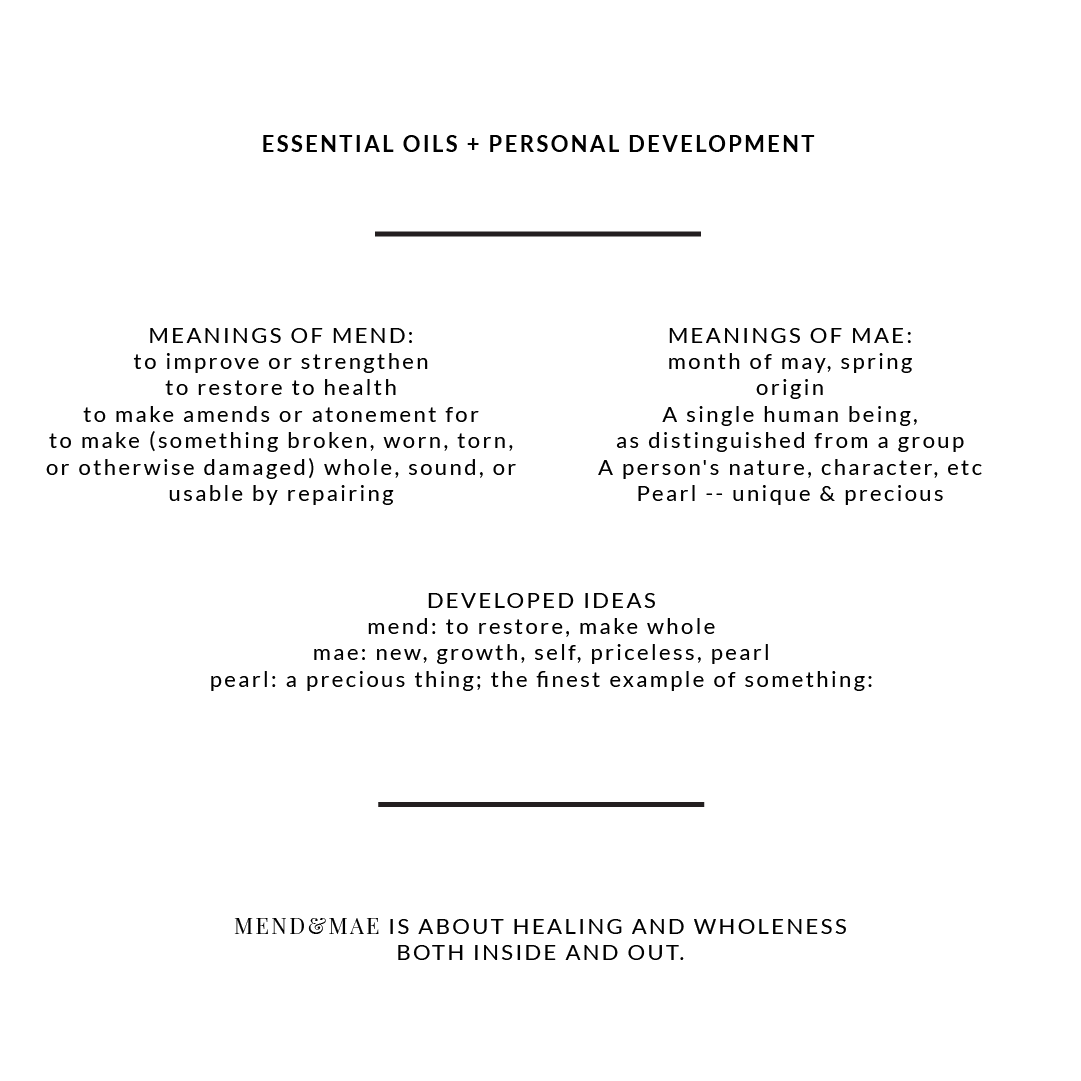
People say, "It's not personal, it's just business." But that's not what I wanted for this brand. I started by researching her name; the history and origins of her unique spelling, Meaghan.
The process of getting to Mend & Mae
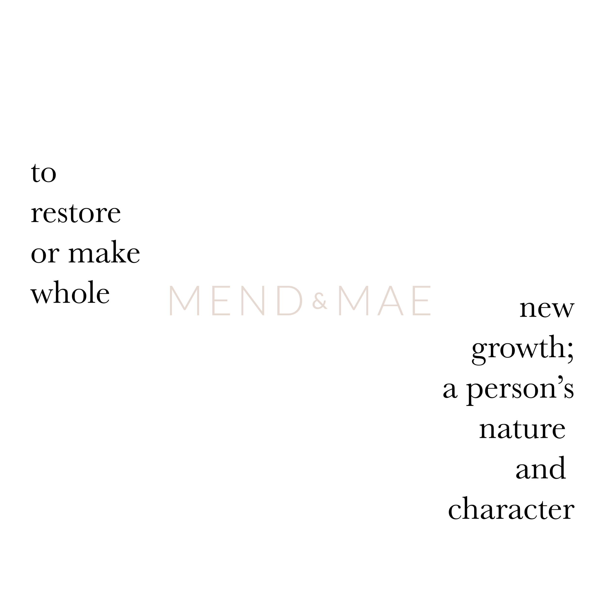
Combining the meaning of her name with Maeghan's unique values of personal coaching, which are are less about striving and improving and way more about healing, health, wholeness, we chose Mend&Mae.

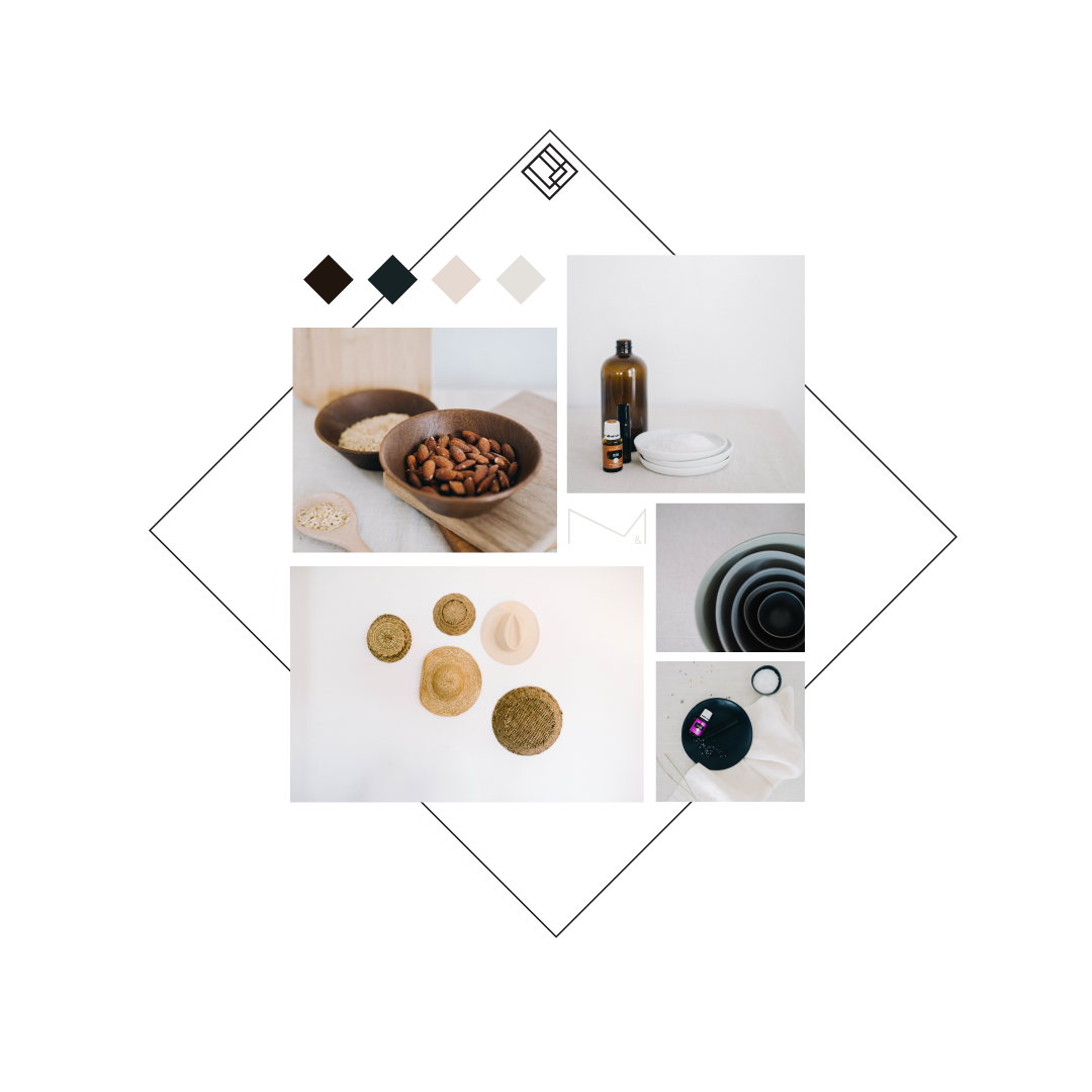
Collaborative board on pintrest.
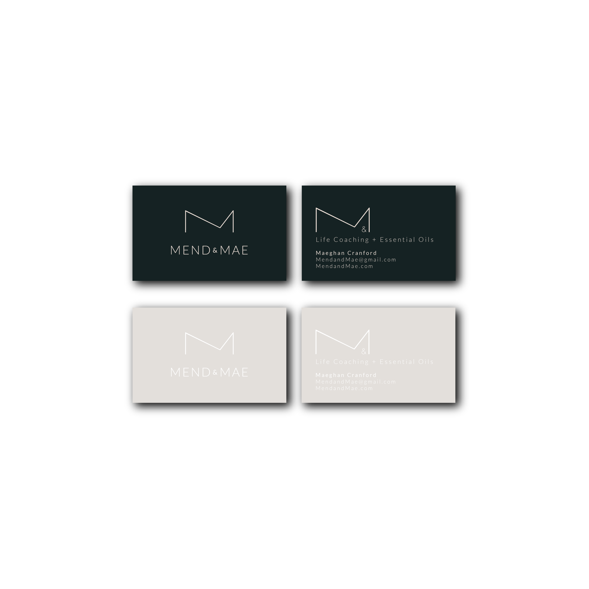
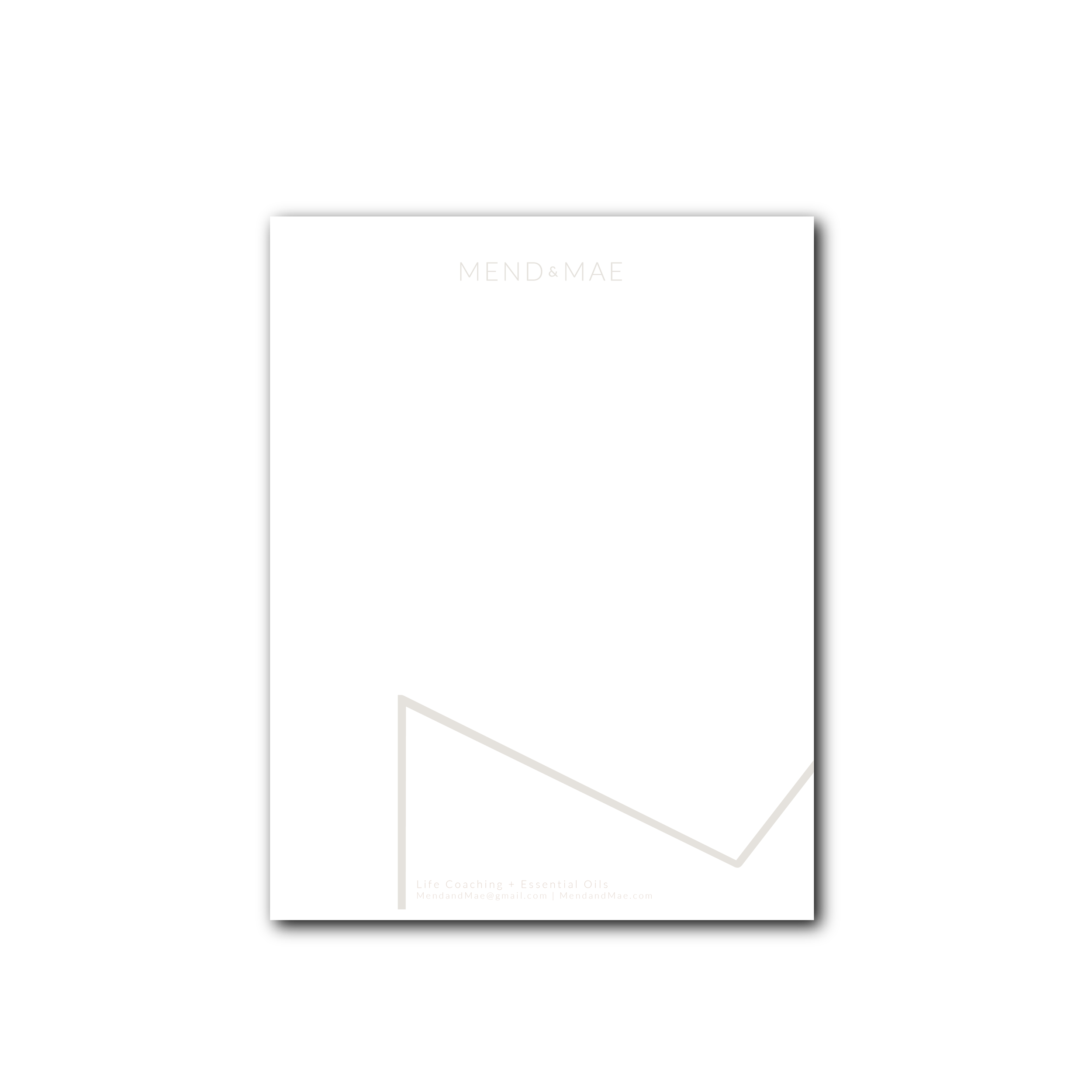
BRANDING
For the look and feel of the brand, we collaborated collecting inspiration for the logo and squarespace site. We chose a neutral color palette with a bold green-blue and a modern type-face. The "M" icon is imperfect; not symmetrical symbolizing the continuous journey we all must take to become the fullest version of ourselves.
Squarespace site
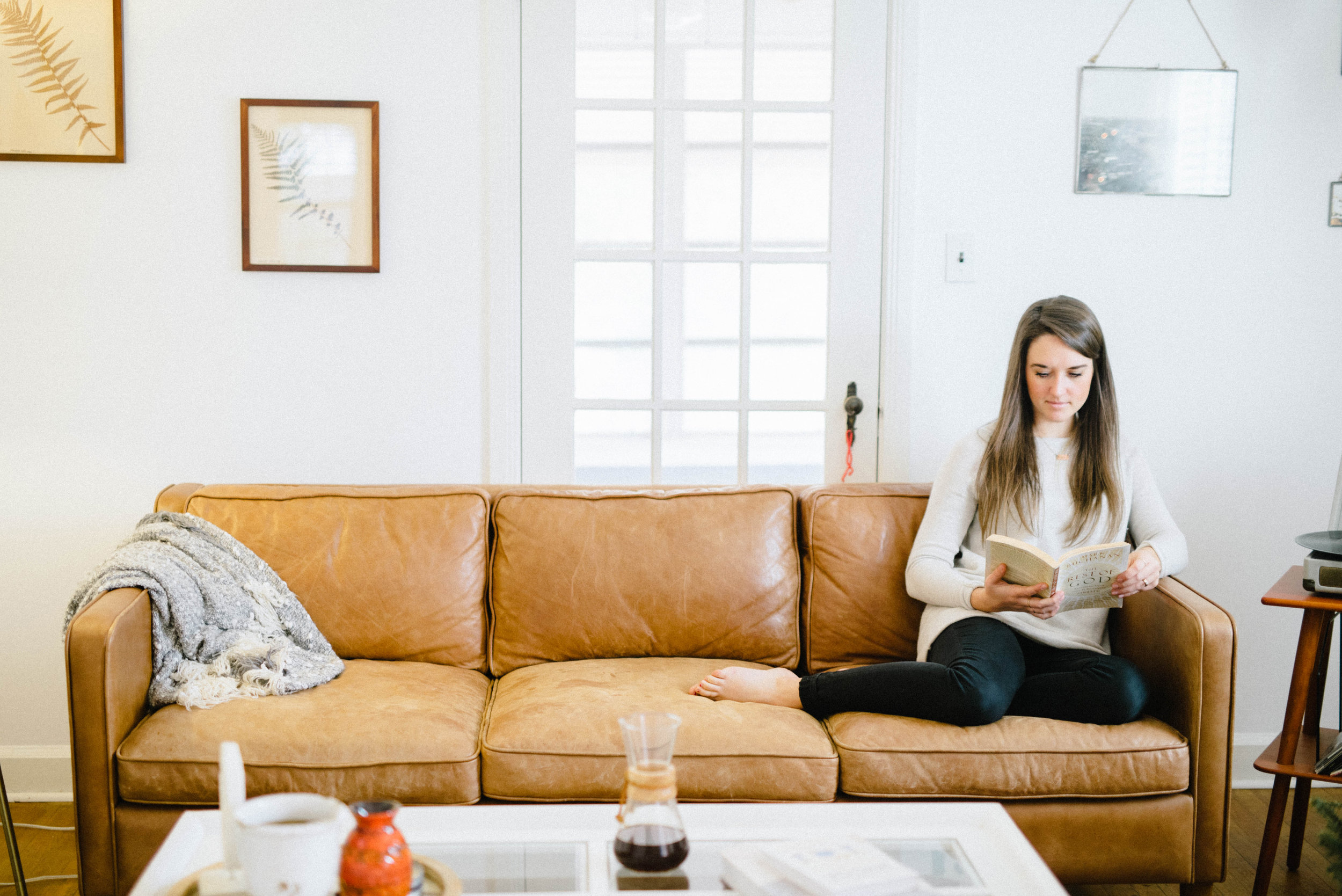
Meaghan had a unique vision for the site. Working with a brand photographer, Grace Jayne Photography and using the Clay template from Squarespace we created a soft, clean site to showcase and invite people into the journey of healthy growth both inside and out.
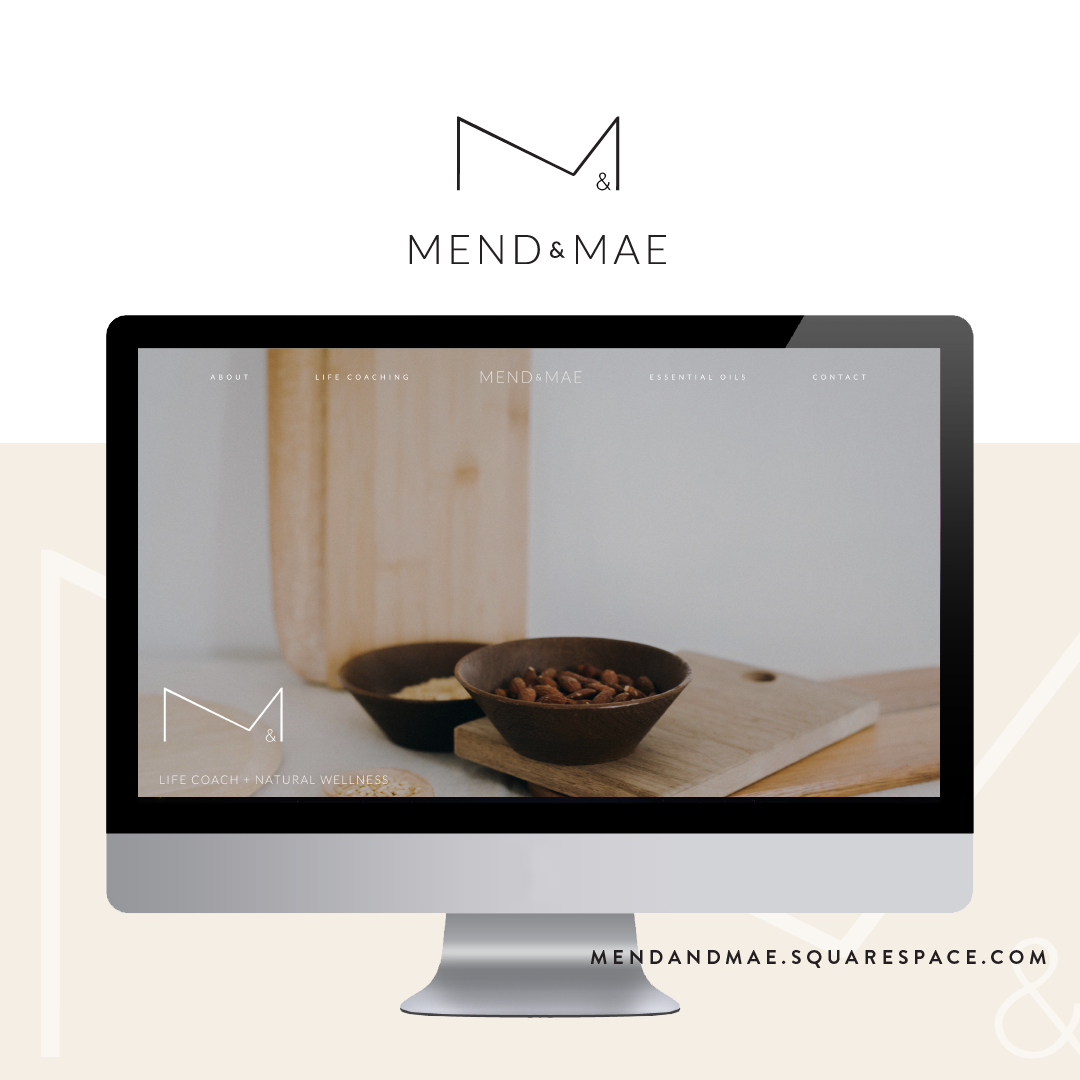
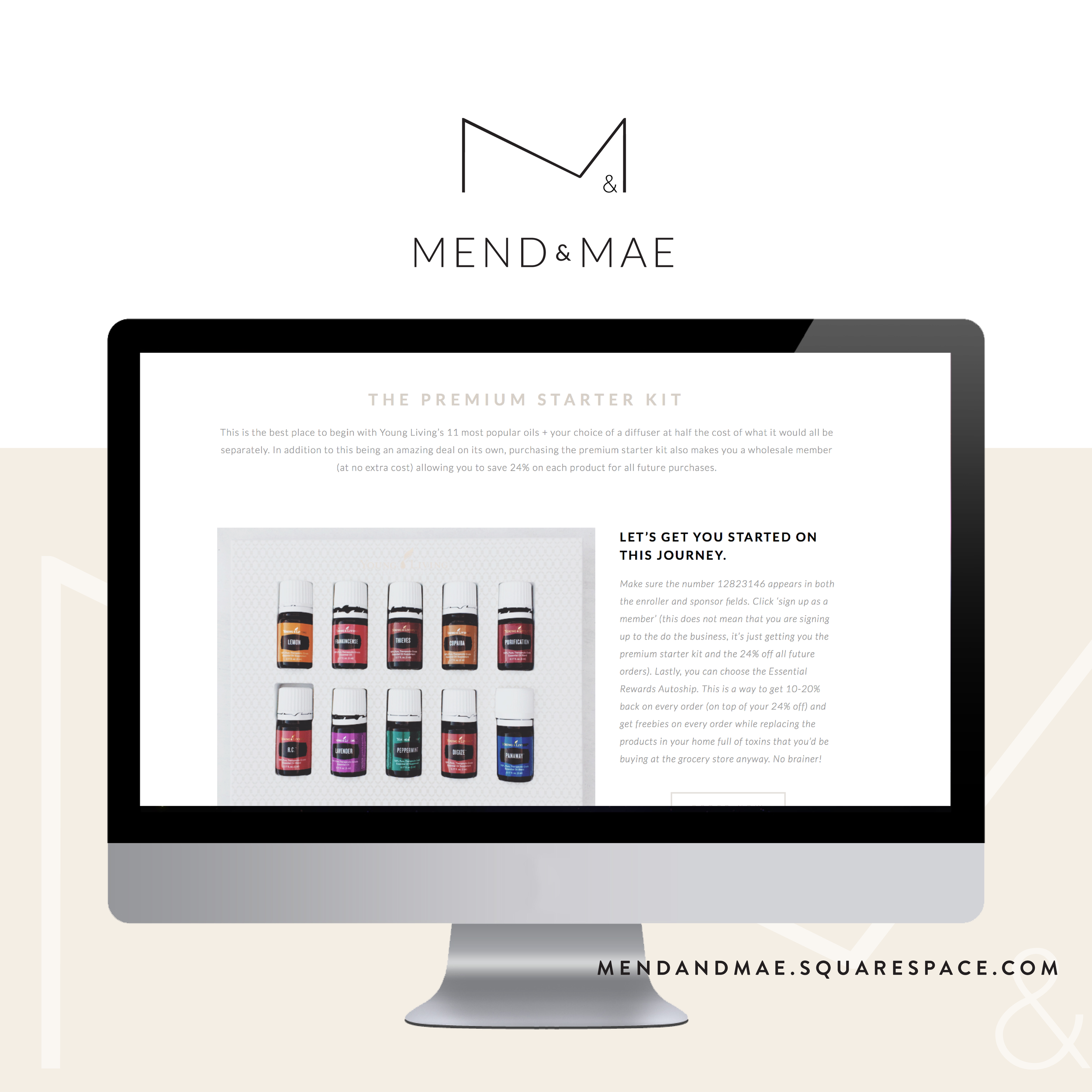
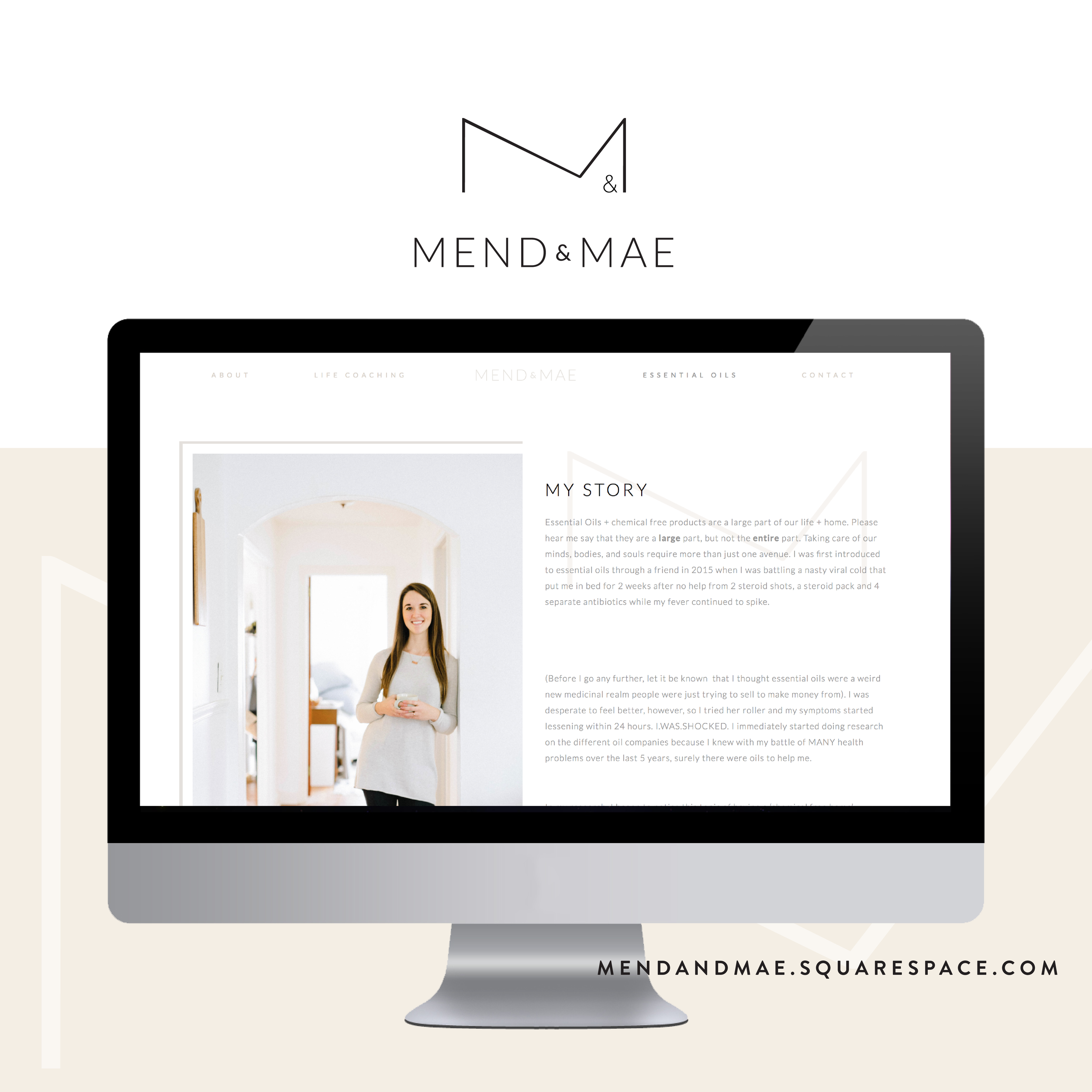
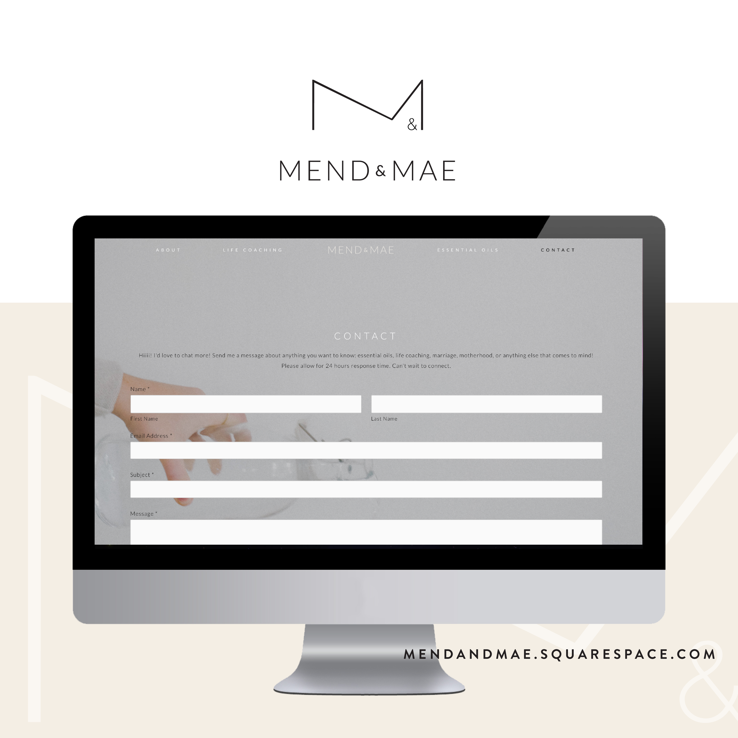
May favorite elements of this project are the full screen image on the front, and the custom coding done on the image blocks to carry the brand throughout the site.